HealthEd of New England
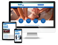
This new website for HealthEd of New England replaced an outdated HTML site that was not very functional for users and difficult for the owner to update. The design shows the professionalism and dedication of H.E.N.E. and makes the most important function of the site very prominent…Register for Classes.
The site is very user friendly and new classes can easily be added by the owner who said:
“I have to say that my website is amazing and you did a fantastic job. Your design looks so professional and everything is so clear and user friendly. I don’t imagine I will ever again get calls from clients saying ‘I couldn’t figure out how to pay on your website.’ ” – Barbara Augello, Owner, HealthEd of New England
- See more…


New England Jewelry
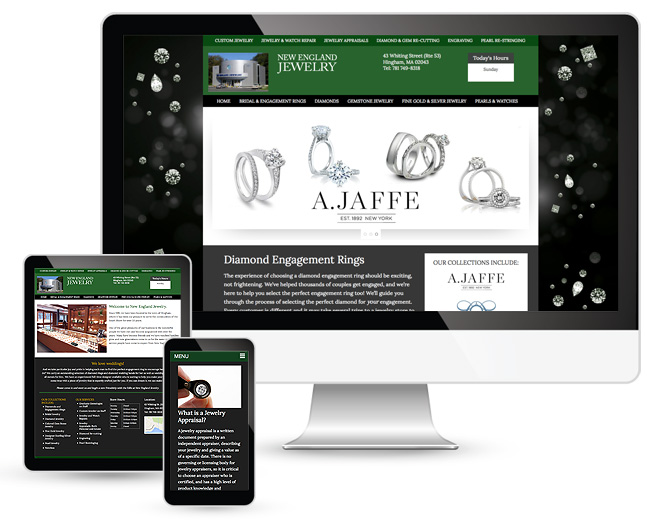
New England Jewelry didn’t have a website when they approached XBM to help them start an online presence. The new site was developed around their most important products, diamonds and engagement rings. They also had a problem of online listings confusing them with another jewelry store just a few doors down on the same street. We were able to clear that up for them and launch a site with powerful SEO to help with their search engine rankings.
- See more…
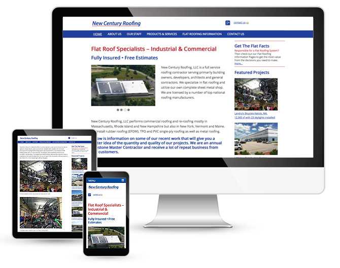
New Century Roofing
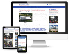
New Century Roofing’s existing website needed technical and design updates in order to be converted into a responsive site for tablets and mobile devices. This provided us with an opportunity to add new content and reorganize the existing content to be more effective in attracting new customers for the company.
- See more…

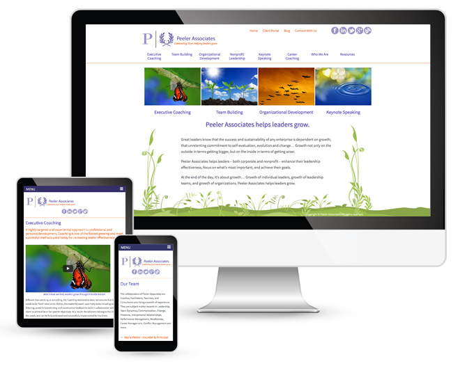
Peeler Associates
The Peeler Associates website was part of a rebranding project for the company. XBM developed new “natural” graphics with a vibrant color palette that speak to the company’s new tagline “Helping leaders grow.” The client is very happy with the new site and customized WordPress CMS we developed for the project that allows them to easily update their own site. They have received many positive comments on the redesign.
- See more…

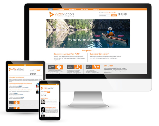
Alter Action
The AlterAction website was part of a complete rebranding project for Beacon Consultants. XBM developed the new name, color palette and website. The logo was outsourced to an online design “contest”, it is not what we would have chosen for the rebranding. The client is very happy with the new site and customized WordPress CMS we developed for the project that allows them to easily update their own site.
- See more…

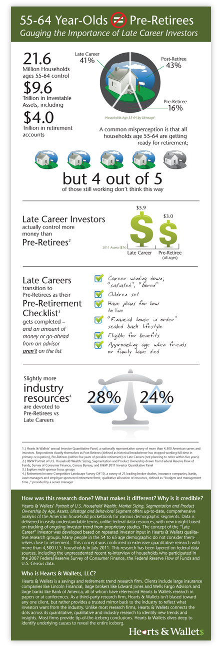
Hearts & Wallets Infographic
This infographic was designed to bring some of the quantitative research this firm specializes in to life.
- See more…

Western Schools
The client wanted a new look for their catalog of healthcare education courses (CE’s) that is distributed to medical professionals. Previous catalogs had featured stock photography of medical personnel and were getting stale. Here we used their book covers as the cover art and used a clean, organized interior layout for a very successful mailing.
- See more…
-

Before the redesign.
After the redesign.

Hearts & Wallets
Cover designs for the client’s family of research reports aimed at the financial industry.

Burakoff Consulting
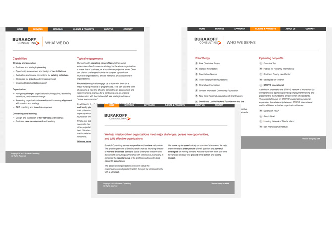
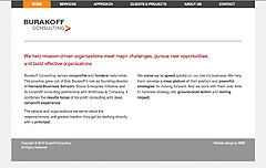
Burakoff Consulting came to us to design a new logo and website that reflects their company’s image. It needed to be clean, clear and uncluttered with a sophisticated style. We delivered an understated design with pops of color that the client loves. We were very excited to work with a client who loves minimalist design.
View the website design.
Burakoff Consulting
This website was designed to have a very minimalist feel. The client wanted a neat, clean design with just a few pops of color to create visual interest. It’s definitely a site where less is more and the text is given the staring role. The client was extremely pleased with how we made his style work for him.
- See more…
